Category: Transportation
Saanich closes a gap on the Lochside Regional Trail
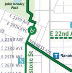
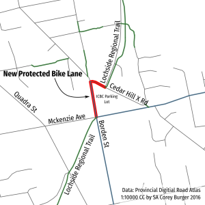 Saanich is working right now to close one of the worst gaps on the Lochside Regional Trail – the missing link from McKenzie Ave to Cedar Hill X Rd.
Nearly everytime I have ridden through this intersection in the summer I have ended up having to guide somebody headed north to the trail. This new lane will make that a thing of the past, as it offers a clear, unambiguous path from one section of trail to another.
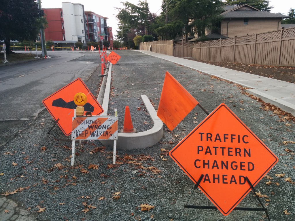
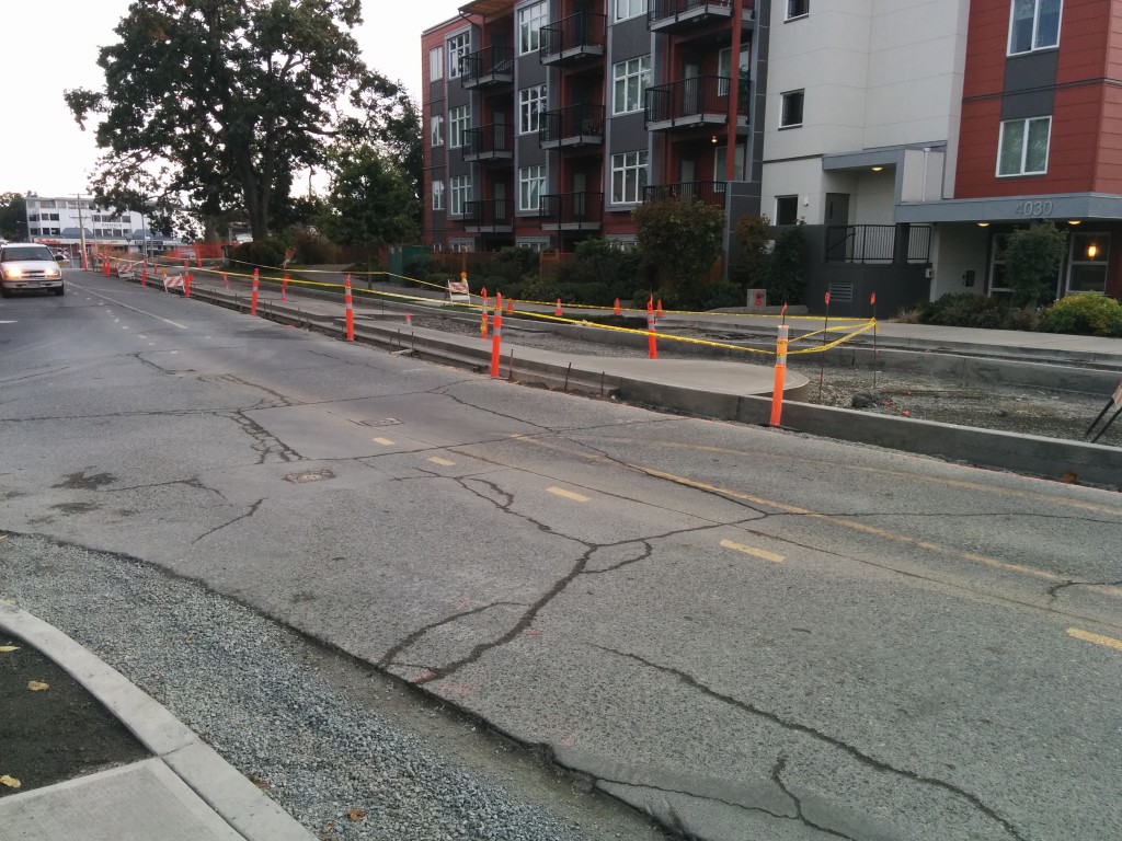
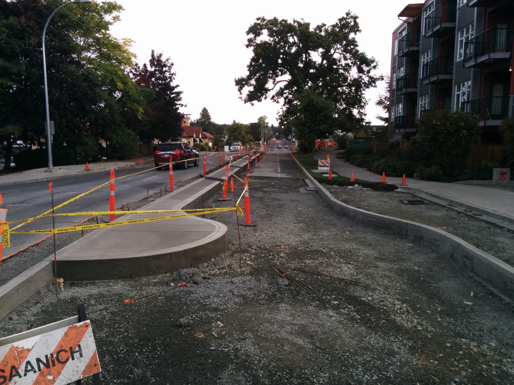
Concrete has already been poured for some of the project, but completion is still a few months off. The final design will look something similar to this concept (PDF).
Yesterday, this is what is it looked like:
The most ridiculous bike detour
Bike routes love to detour straight up giant hills. This is usually to avoid having to go along major roads. There is a fun one of the BC Parkway in Vancouver:
But I think I found the prize for most ridiculous detour ever. It is in New Westminister, a city that isn’t exactly flat. But take a look at this:
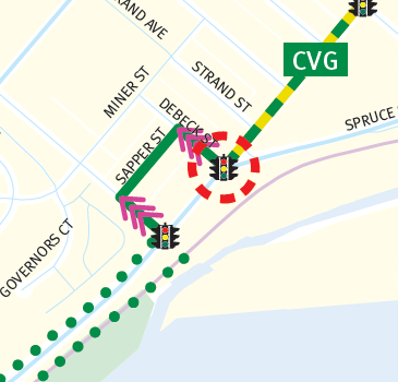
That’s right – this is a one block detour that goes basically straight up a hill. It looks like this:
Which meant that I (and the other two bikers coming the other way) – rode the narrow sidewalk for one block. I hate riding the sidewalk – but sorry, I am not riding up that hill just to go down it again. And biking on-road wasn’t going to happen either, not with 60 km/h+ traffic speeding by on E Columbia Ave.
And all this along what is supposed to be the family bike friendly Central Valley Greenway. If we want biking to be normally, we badly need to build continuous routes, ones that follow sensible, flat routes.
Further thoughts on Bike Score vs bike mode share
So yesterday I wondered why Victoria was so odd, given our bike mode share doesn’t match our Bike Score. Today I dig into another data point: the CRD’s Origin & Destination study (PDF) conducted in the fall of 2011. When looking at all travel reasons (work, school, etc.), it lines up a lot nicer with Bike Score data:
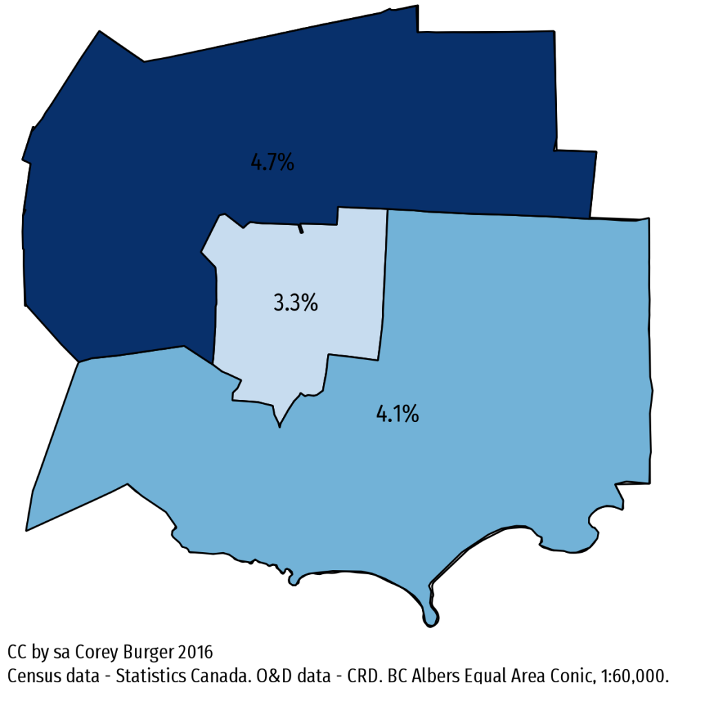
But what about the difference between this data and the NHS data we looked at yesterday? To compare them, you need the same geographies. Of course, the boundaries of these don’t quite line up (that would be too simple):
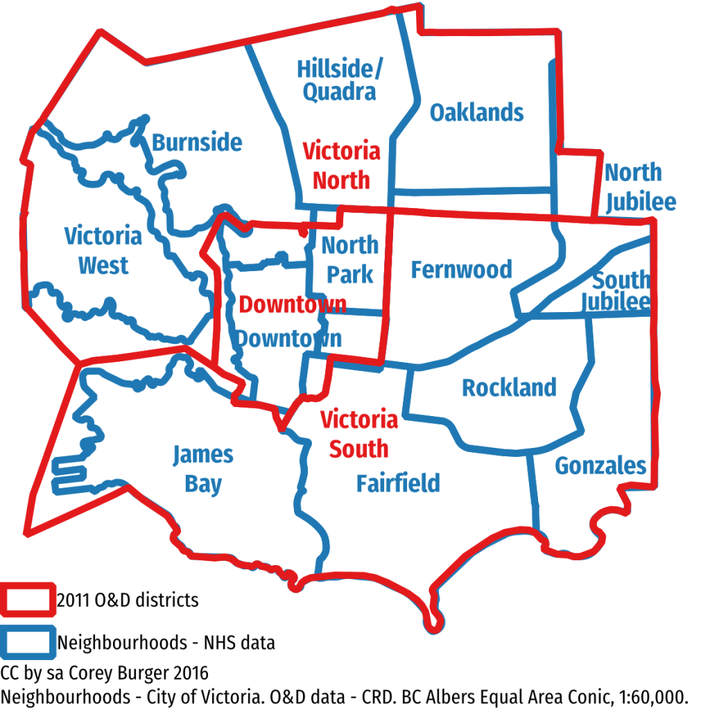
But when you compare the two using the O&D geography, comparing north to south shows the same pattern: north is higher in the CRD O&D while that is reversed in the NHS data.
| NHS (work trips only) | CRD Origin & Destination (all trips) | |
| Victoria North | 7.97% | 4.7% |
| Downtown | 8.11% | 3.3% |
| Victoria South | 12.07% | 4.1% |
What about comparing when the surveys were conducted? NHS asked about the week of May 1-7, 2011, while the Origin & Destination ran in the fall of 2011. But the weather impact should have hit both surveys equally, so that can’t explain it.
Margin of error might explain it. The CRD O&D at this level has a margin of error with between 2.8% and 9.5% (so larger than any differences). NHS doesn’t report margin of error, but it had a non-response rate of around 25%. Which is to say: take all these numbers with a grain of salt. So maybe all of this can be chalked up to bad numbers.
Bike mode share vs Bike Score: Why is Victoria so weird?
SFU’s Meghan Winters recently completed a paper looking at Bike Score and bike mode share (SFU news article) across several US and Canadian cities. The findings were as you would expect: higher Bike Score means higher bike mode share (to work). Except Victoria:
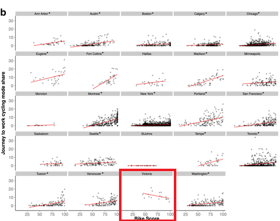
It looks like our bike score is actually negatively correlated with Bike Score. But why? Let’s look at where people bike in Victoria:
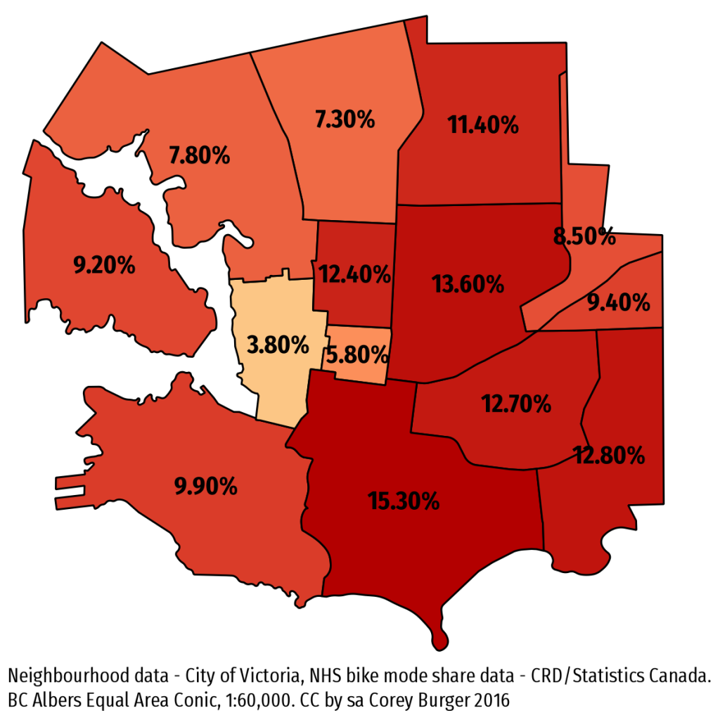
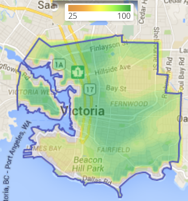
We have really high bike share in the south and east, but those areas show up very low in Bike Score. Conversely, there is low bike mode share in the north, especially Burnside/Gorge. Downtown and Harris Green also have low bike share largely because most people walk to work. But all these low mode share neighbourhoods have high Bike Scores:
I have long suspected that Bike Score relatively simplistic breakdown of “bikeability” is a bit too simple. This isn’t really the fault of the Bike Score people, it really is a data problem. Good data about whether a street is “bikeable” simply isn’t available. What is available is infrastructure and topography.
In our case, most of the bike infrastructure that Bike Score tracks goes east or north/west – bike lanes on Douglas/Blanshard/Government or Fort/Yates/Pandora/Johnson and the two regional trails which run north/west.
Still, Bike Score is a valuable first-cut of a tool to help figure out what is happening. That Victoria doesn’t fit the pattern isn’t surprising, we are the anomaly when it comes to mode share – being several percentage points ahead of the next highest city in Canada. To better capture where people bike, I would love to see Bike Score innovate and do something similar to the CRD comfort index and use that instead of pure infrastructure, but given the massive data challenges, I am not holding my breath.
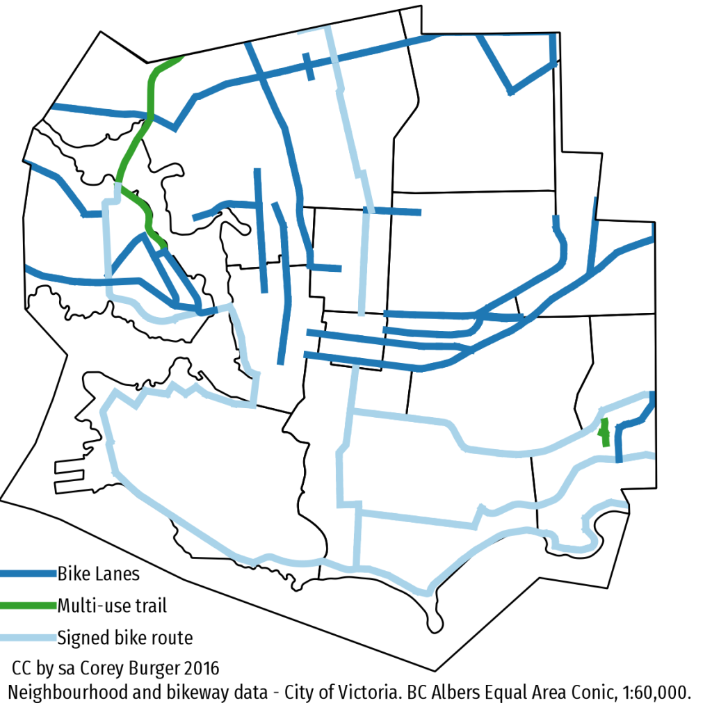
10and3 measures “traffic congestion”
Or at least, they claim to. They’re not. What they are actually measuring is motor vehicle speed and the difference between the worst trip and the best trip on a few selected journeys across a city. Unlike most of these studies, they actually included Victoria, so this actually have local relevance. So, what exactly is their study missing:
Motor Vehicle Traffic, not Traffic
It is framed as a study of traffic congestion, but it actually only looks at motor vehicle speeds as measured by Google (which pulls their dataset from Android phones such as mine). A helpful diagram of what they are missing: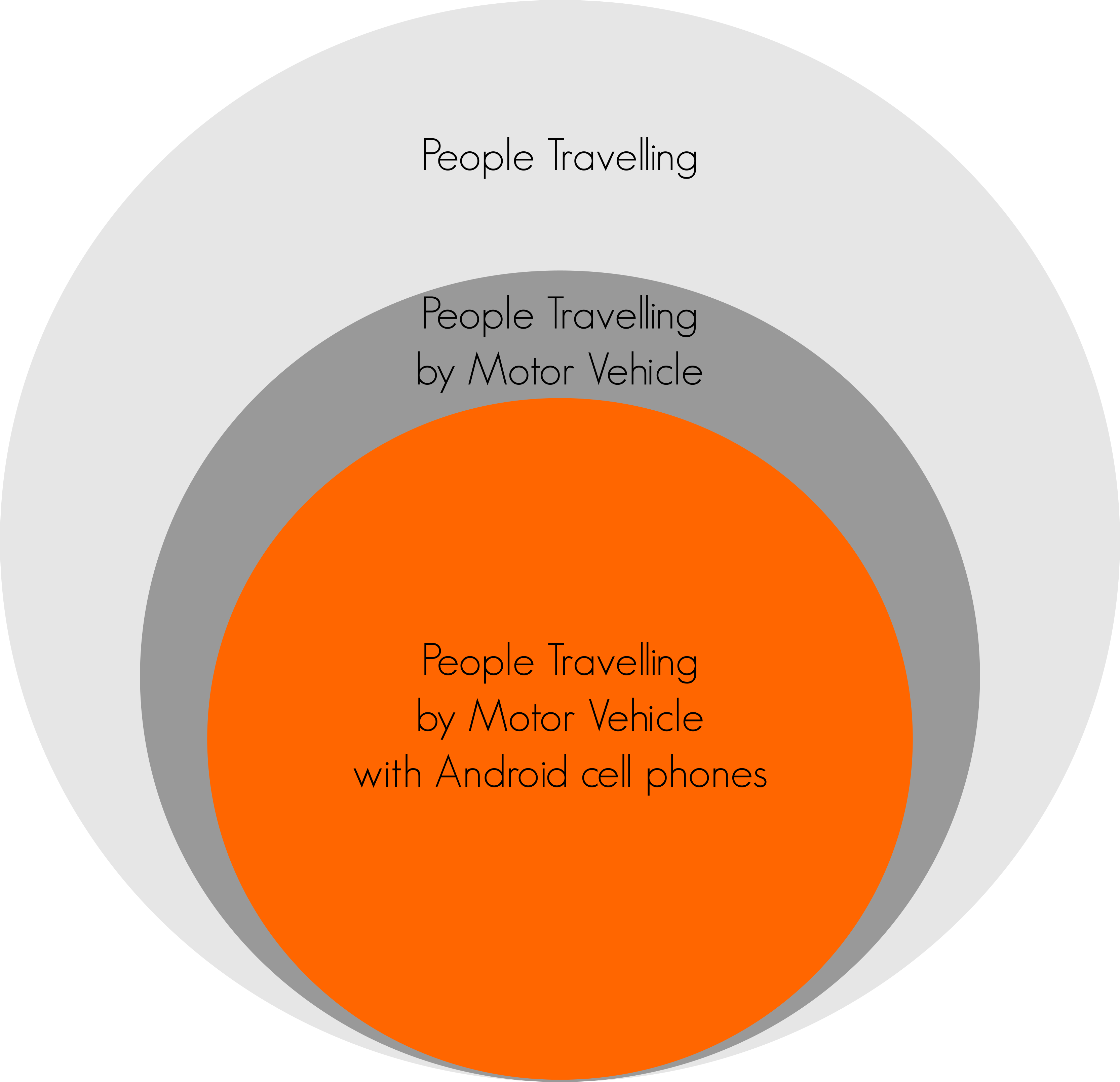
Data notes: This assumes 75% of people use a motor vehicle to travel (The 2011 Canadian average for commuting mode share by motor vehicle is 74%), and that Android usage is 84% (the 2014 worldwide market share).
Measuring Longest to Shortest Time Journeys
TomTom does this as well (and quite rightly gets flak for it). Here is the problem: Let’s look at two commutes: mine and a friend in Vancouver’s. His commute time of 30 minutes is normally double mine, but during peak periods we both take 15 minutes longer to get to work. By this measure, he is worse off than I:
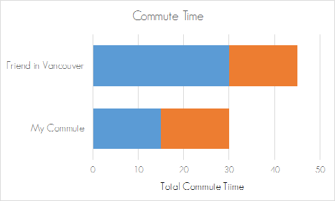
But if you use the 10and3/TomTom methodology, what matters is the difference between the fastest and slowest journeys on the same route. Suddenly my delay was worse than his was:
By this measure, my city is clearly more congested than his, even though my worst commute time ties his.
Why does any of this matter?
Because it is overall commute time that actually matters. Study after study has shown that longer commutes are worse for health, friendships, relationships, community connections, volunteerism, the economy, etc.
Further, by only focusing on the motor vehicle, we end up with perverse results such as wider roads and bridges (which do nothing to reduce congestion) rather than better land use and more active transportation & public transit. Check out some of the links below for further documentation.
Don’t believe me?
People much smarter than I have dug into the 10and3/TomTom methodology and come away unimpressed:
TomTom latest meaningless congestion report– Transport Blog
The problems with measuring traffic congestion – Reuters
Smarter Congestion Evaluation – An Example – Todd Litman, Victoria Transport Policy Institute
Smarter Congestion Solutions in 2014 – Todd Litman, Victoria Transport Policy Institute
Thoughts on Portland’s Greenways report
Earlier this week the City of Portland put out a report on their neighbourhood greenways (historically called neighbourhood bikeways), which like Vancouver, formed the backbone of their biking network for several decades. There has been a lot of talk in Portland about the frankly terrible conditions that some of the greenways have descended into: lots of fast moving cars making biking downright uncomfortable and dangerous.
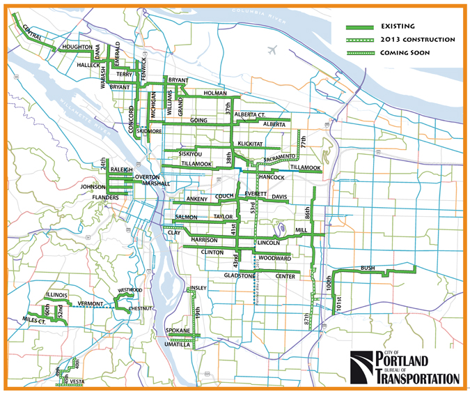
What makes the report interesting is that is the first that truly digs into the existing conditions and sets out clear targets for greenways, which have traditionally get a sign and not much else (as anybody riding on Vancouver St or Haultain in the City of Victoria can tell you). Looking at the report, I had a few thoughts about what it gets right and what could be improved.
What the report gets right
It exists
No other city that I know of has done a comprehensive look at their greenways/bikeways in this way, especially looking at motor vehicle volumes and speeds. Kudos to PBOT for taking this one.
It highlighted the role a greenway plays beyond biking
Bikeways were rebranded greenway to recognize that their role goes far beyond making biking more comfortable for the All-ages and Abilities crowd. Portland has been great about creating people-spaces along these greenways.
The focus was on reducing motor vehicle speed and volumes
In the grand scheme of things, nothing else matters. Bioswales, signage, wayfinding and pretty pavement don’t matter unless the number of cars and how fast they are going drops
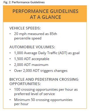
It sets targets
Neighbourhood bikeways lack good design criteria. Unlike say, a bike lane, there isn’t a set of universally accepted standards. There were informal numbers, such as 1,000 cars per day, or 30 km/h, but until now nobody has truly coded that into their policy documents in such a strong way. This report lays it out in bold, clear terms, allowing staff, councils and advocates to start a conversation at the same place.
What needs some work
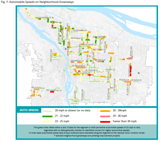
Cartography
Sorry PBOT, but “No Data” and “Meets the Standard” are completely different. No Data means just that; conflating it with areas that have been tested and meet the standard tells us nothing. PBOT should reissue these maps clearly separating out No Data from Meets Standard.
Acceptable vs maximum
The report rather sets out 1,500 cars/day as the acceptable, but 2,000 as the maximum. But bizarrely, from 1,500 to 2,000 cars per day is unacceptable, yet action is only taken until the number passes 2,000. Given that traffic volumes can vary huge amounts per day (30%+), the threshold for action should be 1,500, not 2,000.
(Yes, I am aware of the Oregon-specific legislative requirement regarding speed limits and cars per day)
Final Thoughts
All in all, an excellent report that other cities should emulate. Neighbourhood greenways/bikeways are such an important part of the city fabric, both for bikes and more, that
If you want to read more, I suggest any of the posts on the topic by the always excellent BikePortland:
New activist group off to fast start: First protest ride is tonight
Council vote today would allow more diverters on neighborhood greenways
Neighborhood greenways breeze through council with unanimous support
Morning bike flow off the Johnson Street Bridge
As council debates the Pandora and Johnson protected bike lane project (options for which I analyzed already), I figured I would see where people go when they bike off the Johnson Street Bridge into downtown. Yesterday was a cold but clear day, and the numbers showed it:
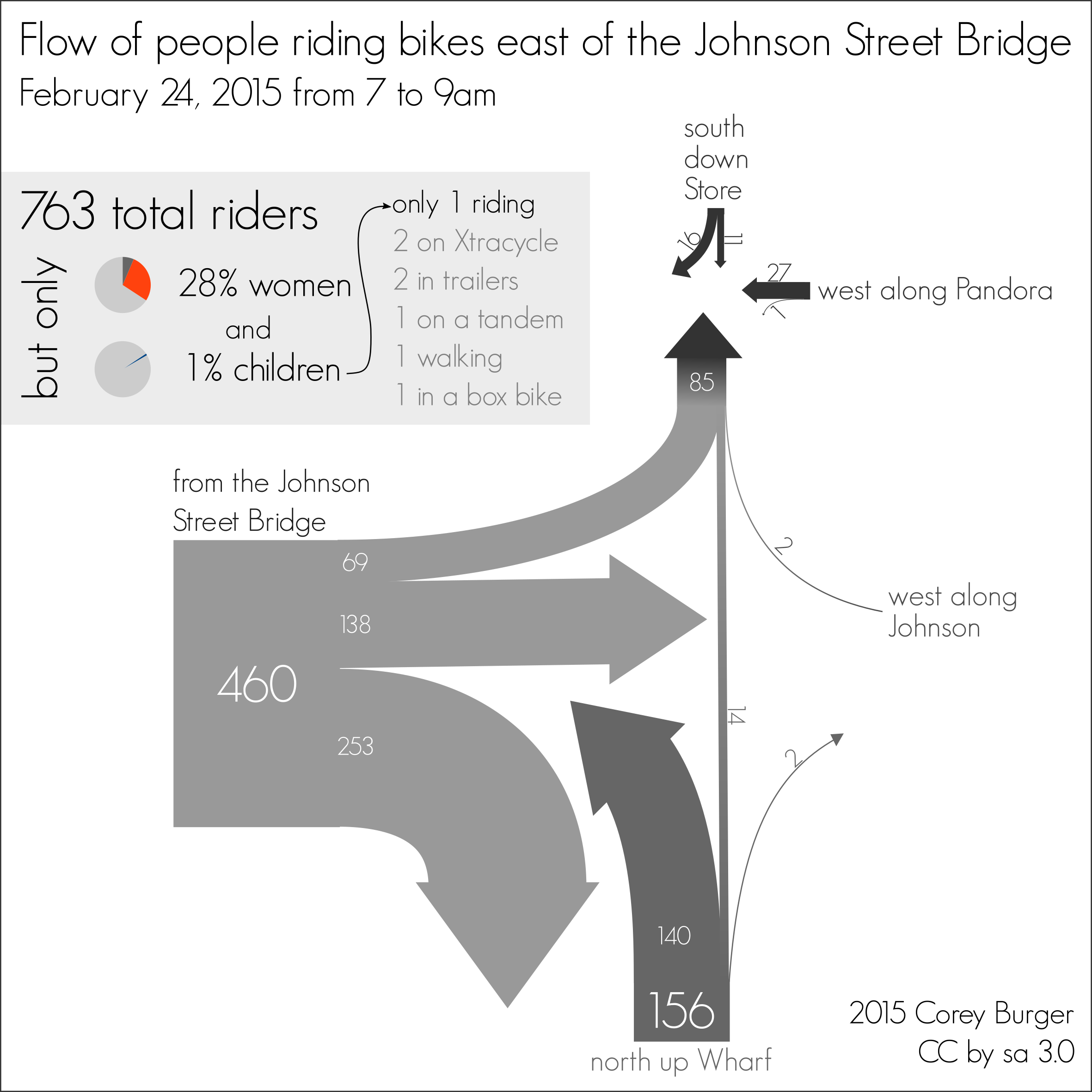
Caveats
First: This is a one-day, two hour count in the morning. Margin of error with short-term counts is high. Numbers are certainly higher when it is warmer and we have more tourists out.
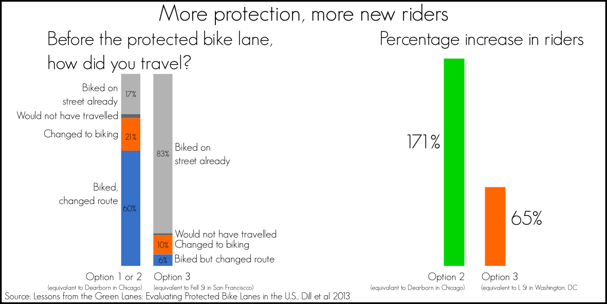
Second: Patterns of biking shift as infrastructure changes. People don’t usually pick the fastest route to their destination, most trade-off of distance for comfort (how much distance for how much comfort is a subject of a great deal of studies, including this great one [PDF] by Jennifer Dill at PSU). So building the new protected bike lanes on Pandora and possibly Johnson will shift biking patterns considerably, as I pointed out the other day with Dill’s later research on the new protected bike lanes in various US cities. See the large percentage of riders in blue below:
Safe, comfortable, convenient: analysis of the Pandora St Protected Bike Lane options
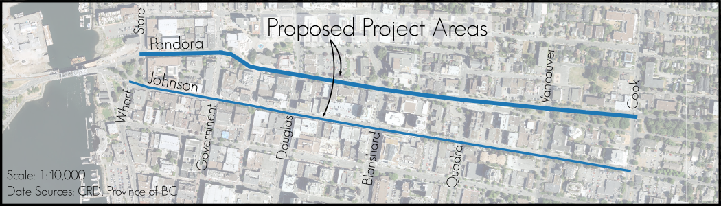
The era of modern, protected bike lanes is finally coming to Victoria, as the City of Victoria looks to close a gap along Pandora St from Cook St to the Johnson St Bridge. Staff have recommending a trio of different options (PDF) but not much else to help guide a decision. Looking at the wealth of modern research on biking out there, what does council need to know before they make a decision? Turns out, nearly everybody who studies this agrees: we need bikeways that are safe, comfortable and convenient. How do the three options for Pandora stack up?
Context
Running right through downtown, the Pandora corridor connects the major north-south streets with the Johnson St Bridge. Crucially for people riding bikes, it is a natural eastward extension of the Galloping Goose Regional Trail.
Modern Research
Thankfully, thanks to the long lag between getting our first protected bike lane in the CRD, we have a wealth of research to draw from, including an excellent report by Jennifer Dill and others at Portland State University. She looked at the all the various protected bike lanes in the US, and did a huge amount of research into ridership, comfort, perceptions and other factors. I strongly recommend you read the final report: Lessons from the Green Lanes: Evaluating Protected Bike Lanes in the U.S. I will draw from it below as I compare each of the three options.
Safety
Biking is very safe. Even when forced to mix it up with cars, biking is still about as safe as nearly any other way of moving. But that doesn’t mean the current Pandora is as safe as it could be. Multi-lane roads with high speed like Pandora are probably the most dangerous place to ride currently. Bicycles have to mix with cars, heavy trucks and buses, not a recipe for high comfort. Pedestrians are also in conflict with vehicles turning right.
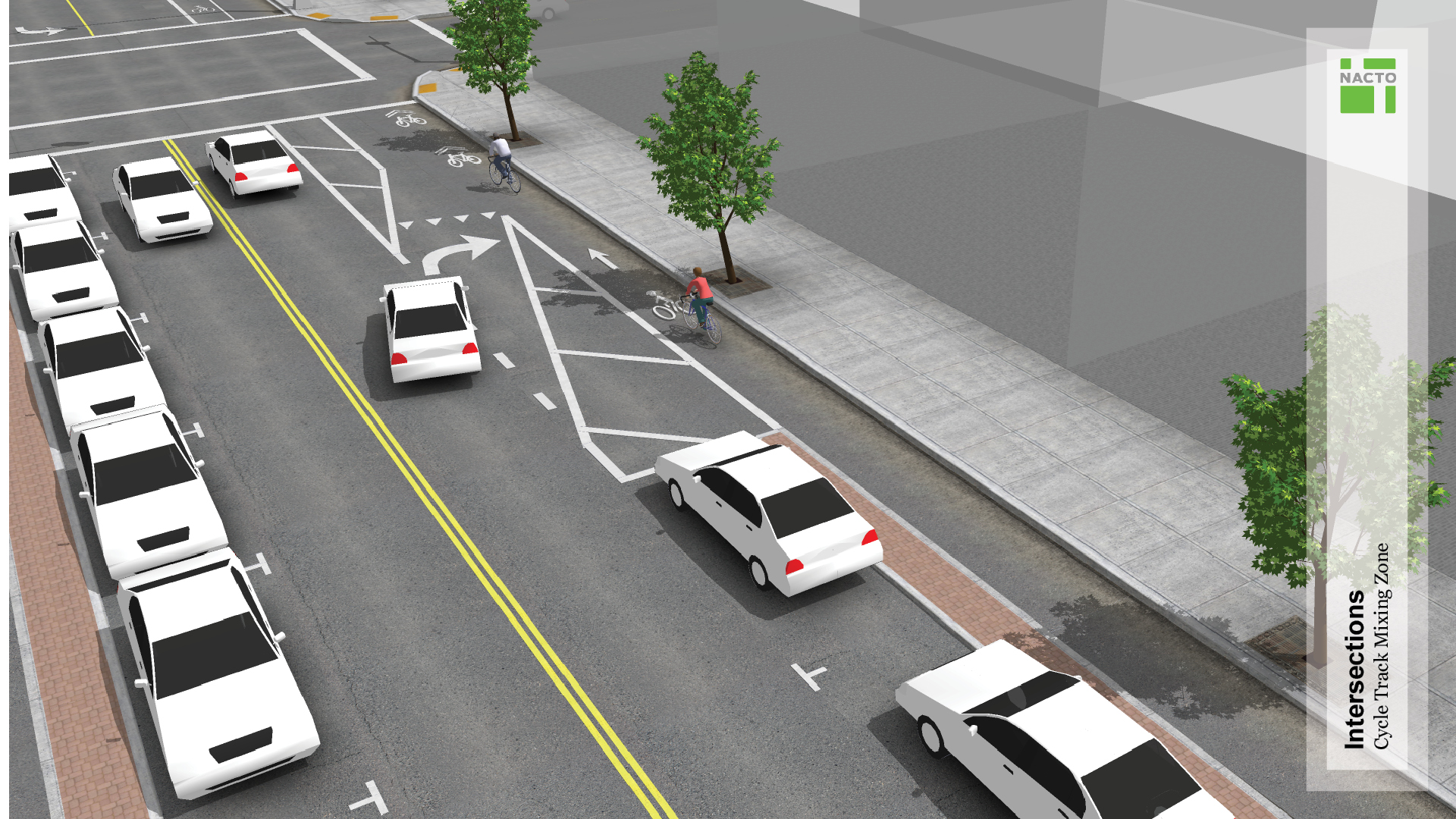
Of the three options, Option 3 has so-called mixing-zones as can be seen to the right. Not only does this create a potential rear-end collision zones, people riding bikes simply find them less comfortable and useful.

Comfort
Comfort and perceived safety are strong determinants for the Interested but Concerned population on whether or not they ride. Unsurprisingly, the two fully signalized options will likely generate the highest ridership gains, especially with helping car drivers choose biking. Fully signalized options not only attract more riders, they also saw twice as many people change to biking than any other design.
Convenience
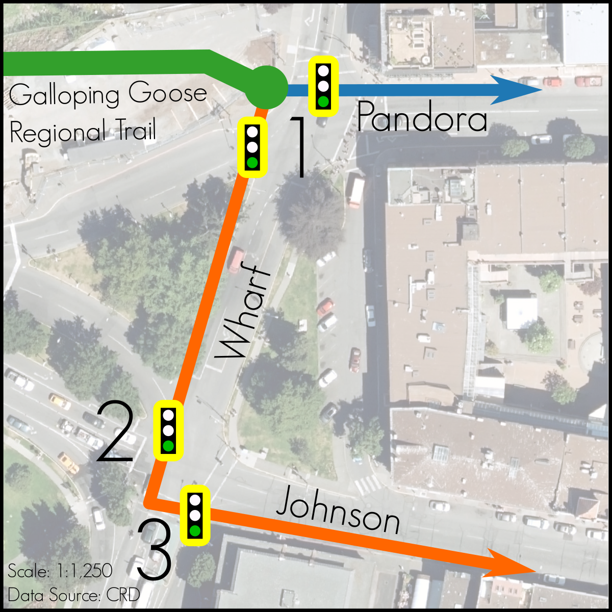
Biking is often the fastest way to travel through an urban area, especially in a downtown where speed is determined more by intersections than the streets themselves. Here the two-way design offers significant speed advantages over either of one-way designs. Bike riders wishing to travel east along Pandora to the major employers or shops along the street need only cross a single intersection just east of the Johnson St Bridge, while either one-way design forces riders to wait two or three light cycles at Wharf Street.
Conclusion
It is pretty clear, once you lay it all out, you get one option: a two-way protected bike lane on Pandora stands out as the best option. Mixing zones in Option 3 are less comfortable and get less riders, while the ease and convenience of a two-way on Pandora with Option 1 can’t be beat.
Putting BikeBC funding in context
Bike infrastructure in the CRD is built in fits and starts, much of it done with grants from other levels of government. Usually these grants are announced with little background information about the projects and where they are in the region, or what has come before. Today’s ICBC announcement of funding around the CRD is case in point, the tweet shows a picture of Bay St at Chamber, with no mention of the additional bike lanes and other work the City of Victoria has done in recent years.
So I thought I would do up a few quick maps of the Ministry of Transportation & Infrastructure’s BikeBC Cycling Infrastructure Partnerships Program (CIPP) funding for 2015 in the CRD, to show how they fit into the larger regional picture.
First, of the 20 projects throughout BC, how much of the funding went to each of the economic regions?
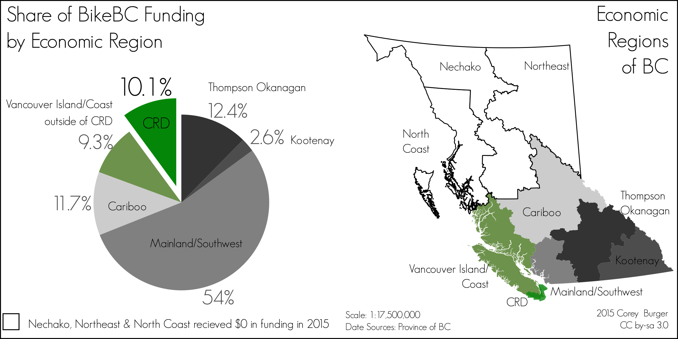 When you slice up pie by population, you find that funding doesn’t fully match population, with the large projects in Kelowna skewing their percentage upwards, while Metro Vancouver and the Fraser Valley RD were much lower. The CRD does not badly, getting 10.1% of the funding despite being only 8.2% of the population (2011 numbers, Census Canada).
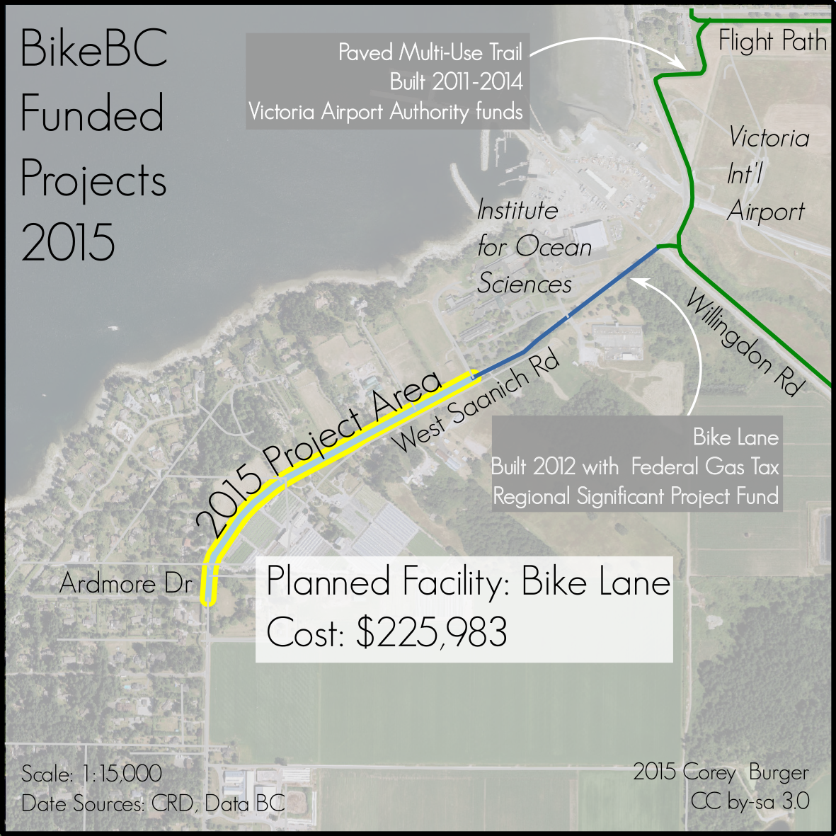
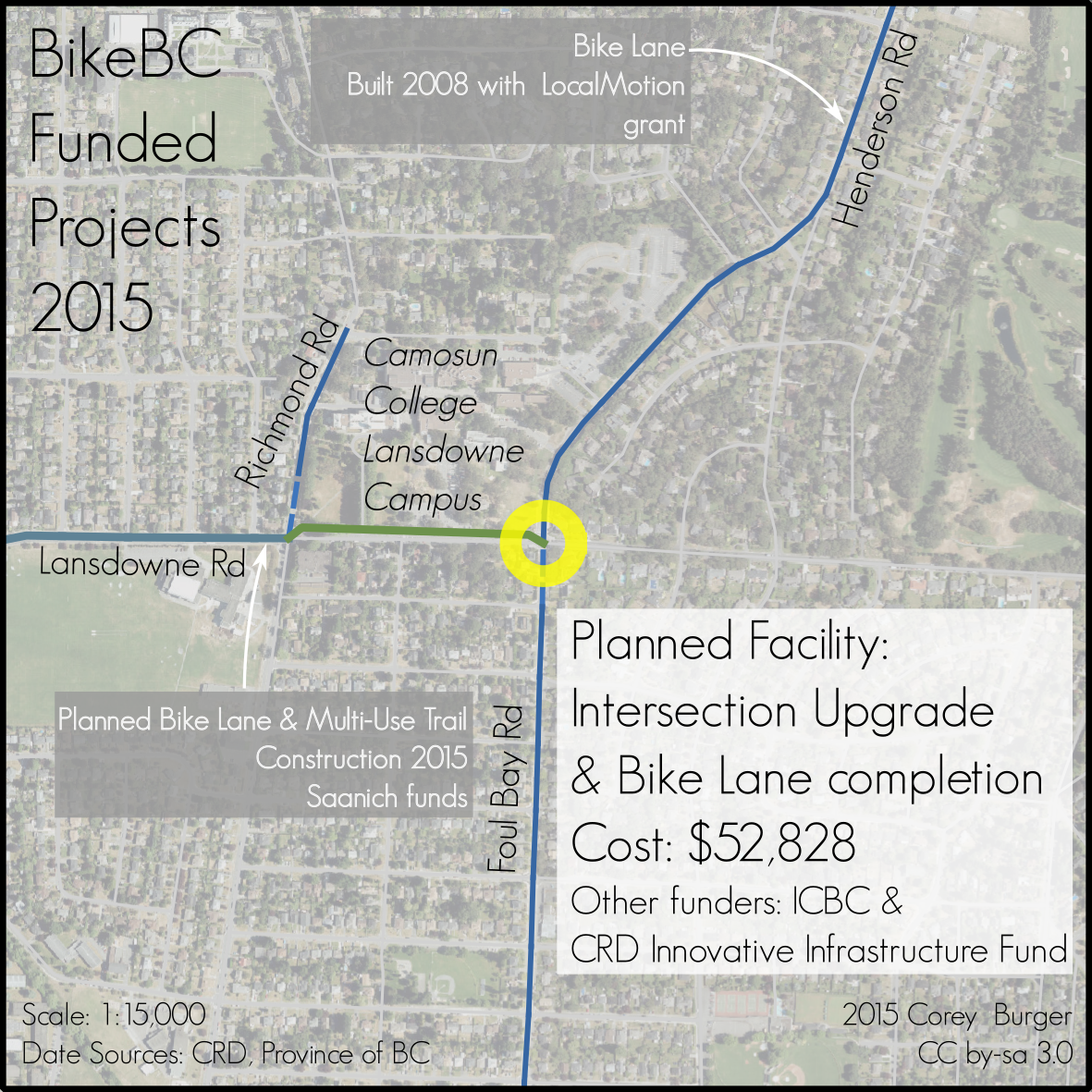
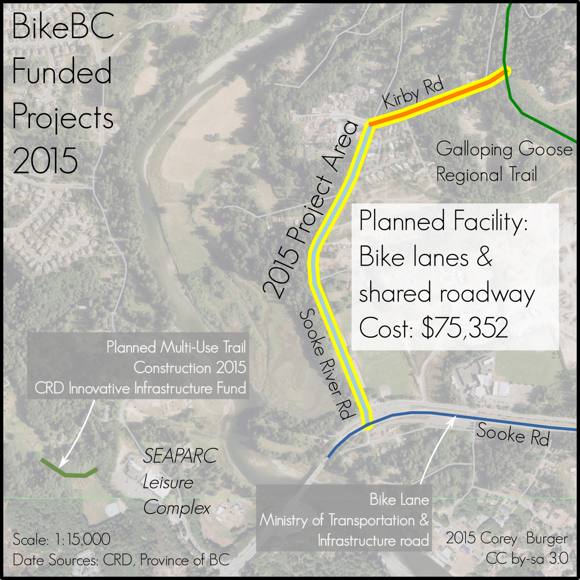
The Projects:
Three municipalities received funding this round: North Saanich, Oak Bay and Sooke. All three could be described as gap-closing projects, connecting existing bike infrastructure better together, although the density of our bike network means that nearly all projects could be reasonably described as gap-closing.
North Saanich
This bike lane project extends existing work on West Saanich Rd and helps like the Ardmore neighbourhood to the airport Flight Path. North Saanich has been looking for funding for this section for some time, after being turned down for Regional Significant Project Funds in 2014.
 Oak Bay
Helping close the gap between Oak Bay and UVic up the Foul Bay/Henderson corridor, this project is actually a joint Oak Bay/Saanich project, as it ties together the work that Saanich will be doing further west in 2015 on Lansdowne and Camosun College. The reason this was a sole Oak Bay project as although Foul Bay straddles the border, Oak Bay is responsible for the entire roadway for Foul Bay Rd to the Saanich border (although Saanich is responsible for the curb, gutter and sidewalk). This doesn’t fully close the gap up Foul Bay hill, as there is still a short section of bike lane to be finished between Middowne and Lansdowne.
Sooke
The need for a connection from the Galloping Goose Regional Trail to Sooke has been long requred, something Sooke has looked into for years, with a long-term plan to connect via a bridge over the Sooke River (PDF). For the immediate future, this bike lane down Sooke River Road will help connect the Goose better to downtown Sooke, for tourists and visitors alike.
(Final note: First post in a long time. My contract with the CRD recently ended, so I have been teaching myself QGIS. All maps in this post made with entirely Open Source software: QGIS, Inkscape and LibreOffice)